
余白の調整をするマージンとパディングの設定
BeaverBuilderのモジュール(要素)の配置と設定でも少し触れたmargin(マージン)とpadding(パディング)の設定。単純な設定項目ですが、しっかりとルールを決めて作成を進めないと、隣り合う要素同士で相殺しあう大変な状況になってしまうので、しっかり確認しておきましょう。
margin(マージン)とpadding(パディング)の初期値を設定する
マージンとパッディングはモジュールやカラム、行それぞれで個別に指定することができます。しかし、ひとつひとつ指定するのは大変なので、サイトのデザインに合わせて、モジュール、カラム、行それぞれに初期値を指定しておきましょう。
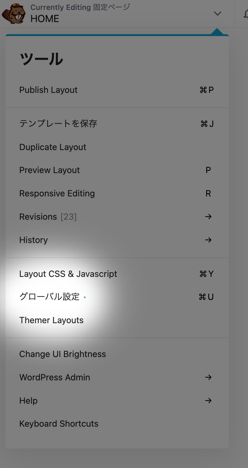
初期値の設定は、グローバル設定で行います。どのページでも良いので、BeaverBuilderを起動します。左上のプルダウンメニューから、グローバル設定を選択します。
グローバル設定の一般タブを開いて確認すると、列(行)のパディングに20px、モジュールのマージンに20px、それ以外は0pxが初期値として指定されています。これを、デザインに合わせて変更します。ここでも、 のアイコンがあるので、デバイスサイズ毎に値を指定し、しっかりとレスポンシブ対応していきましょう。
グローバル設定で初期値を指定し管理するメリットとしては、構築を進める中で、後から全体的な余白(マージン・パディング)を変更したい場合に一括変更できるところです。モジュール毎に都度調整するのは大変なので、グローバル設定をしっかり確認しておきましょう。
値の個別指定と一括指定
入力欄の横にある のアイコンをクリックすると、上下左右4つの値を一括で入力管理することができます。
デバイスサイズ毎に設定しレスポンシブ対応させる
入力欄の横にあるのアイコンをクリックすると、大型デバイス(PC)・中型デバイス(タブレット)・小型デバイス(スマホ)それぞれのデバイスサイズ毎に値を設定することができます。キーボードの「R」キーがショートカットキーとなり、Rを押すたびに、デバイスサイズが切り替わります。
公開前にプレビューでレイアウトを確認する
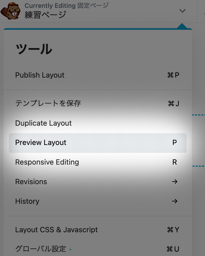
編集作業が終わったら、プレビュー機能を使って実際の画面を確認しましょう。画面左上のプルダウンメニューより、Preview Layout(ショートカットキー:P)をクリックします。
プレビューには、デバイス切り替えのボタンも用意されているので、デスクトップ・タブレット・スマホの各サイズで確認することができます。
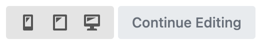
Continue Editingのボタンで、編集画面に戻ることができます。